Chris Brogan, human business maniac, has a logo so I figured I should get one. This wasn’t a priority but was a fun, quick process that……ended up pretty well. What do you think?
Here is Chris Brogan’s logo on his website. Chris is great and probably makes mid-6 figures a year but could really use some help in the WP and graphic design department.
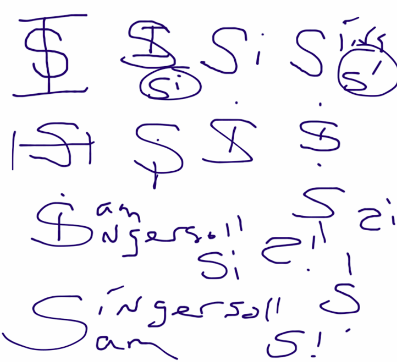
I figured I could do something with the S and the I in Sam Ingersoll, so Emma and I chicken scratched on our iPad.
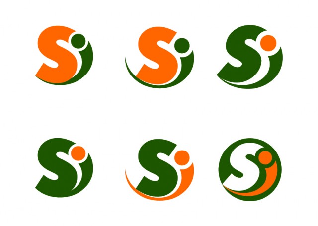
When I got home I turned it into these thoughts…
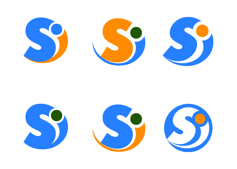
And Enric came up with this…
I liked the middle one because it was clear and a bit stronger that the others while still preserving a little movement, but I still asked him to work up some other colors…
This blue is too generic though and the multicolor seems to clutter more than add to the design, but I did want to try a lighter green. Nah. Too light. Will try again tomorrow.
What do you think?


what a really cool! logo! Thanks for sharing it. : )
: ) Thanks Chris. Let me know if you need to borrow Enric, my graphic designer. $15/hour. I provide concept to him but he’s really good.